
8 Things That Might Be Stopping People From Buying on Your eCommerce Website (and how to fix them)
You feel like you’ve done the hard graft. You carefully selected your products, did twenty iterations of your logo and finally have a website.
But you’ve now got… Crickets.
The truth is most eCommerce sites aren’t terrible. They’re just making small mistakes that stealthily kill conversions, such as being vague about delivery, having checkout forms that belong in the 1990s, or writing product descriptions that sound like they were lifted straight from Alibaba.
So, before you throw more money at ads or assume no one wants what you’re selling, check your site against these common culprits and how to fix them (step-by-step videos included)!
Yes, your site might be a visual masterpiece. Your mum says it’s lovely. But if nobody’s seeing it? Doesn’t matter.
If you’re new to selling online, you might be surprised to learn that the average eCommerce conversion rate is around 1–3%, which means that for every 100 people who visit your site, you might only get 1–3 sales.
So if you're only getting a handful of visitors a day, it’s not necessarily a conversion issue, it’s that not enough people are seeing it.
And it’s not just about volume, it’s about driving the “right” traffic to your site too. All traffic is not created equal. If your visitors are stumbling upon your site via a blog post you wrote about your dog, but you sell windows and doors, there’s a vibe mismatch.
What to do about it
Start by checking your traffic sources in either Google Analytics 4 (GA4) or your website platform (e.g., Shopify). Where are people coming from? Is it through a Google search, a specific social media platform, or referral sites? Also, take a look at your top landing pages. Are they landing on product categories, a particular product page or somewhere else on the site?
Not sure where to look? Here’s a video guide to checking traffic in GA4

On social? Look at which posts are actually driving clicks - not likes. Are they hanging around, or bouncing faster than you can say “free shipping”?
Remember, you want the “right” people coming to your website - so consider using Google Search Console to check what keywords people are using when coming to your website.
Not sure how?
Check out this video

Traffic is a numbers game, but it’s also a relevance game. Both need to be strong if you want sales.
Use these insights to update your content, and if relevant traffic is low, it might be time to consider how you drive traffic to your website

Want help setting understanding Google Search Console or GA4? Check out our GA4 Tracking and Analytics Services
First impressions really do count, particularly online, where a user is trusting your business with their card details! A recent study showed that 94% of first impressions of a website are based on design, not content, so a site which feels outdated, generic or hard to navigate can kill your sales before they even begin.
Trust is one of the biggest silent sales killers, and if your website feels more dodgy than someone selling Apple Airpods on Facebook marketplace, visitors just won’t take the risk.
And trust goes beyond design. If you have a lack of visible info, privacy policies or don’t clearly say who you are, you leave shoppers feeling uneasy - particularly if they aren’t familiar with your brand already.
How to make your site feel more trustworthy
Make it easy for customers to trust you. Start by ensuring your site looks up-to-date and aligns with your brand identity.
This includes using high-quality, consistent imagery, ideally featuring your actual products. Add genuine customer reviews (ideally verified elsewhere, such as Google Reviews or Trustpilot) and ensure that your contact information, returns policy, and privacy policy are linked in the footer.
If you’re currently relying on stock images or off-the-shelf templates, it may be worth investing in a proper photoshoot or brand refresh. It doesn’t have to be expensive, but even minor upgrades can significantly enhance the trustworthiness of your site, alongside using original lifestyle and product images.
Lastly, regularly check your website for broken links, outdated content, or missing pages. These small details can have a significant impact on how visitors perceive your business and whether they feel confident enough to make a purchase.

You know what people don’t love? Adding something to cart, heading to checkout, and then discovering delivery is £9.99 and takes 14–21 working days via a carrier pigeon.
53% of online shoppers report abandoning a purchase due to slow or unclear delivery. If customers cannot quickly determine the shipping cost or the estimated delivery time, they’re far more likely to abandon their purchase and shop elsewhere. Even if they love your product, confusion or lack of information at the final hurdle can be enough to stop them from converting.
Be upfront and specific about delivery from the start. Ideally, show shipping costs and estimated delivery times clearly on product pages, not just at checkout. If you offer free delivery over a certain amount, make it visible — for example, with a banner at the top of your site or a reminder in the cart.
Create a dedicated delivery and returns page that clearly and simply answers common questions. If you ship internationally, ensure that customers are aware of your delivery areas and restrictions. And if you can offer extras like tracked shipping or next-day delivery, be sure to highlight that as a key selling point.
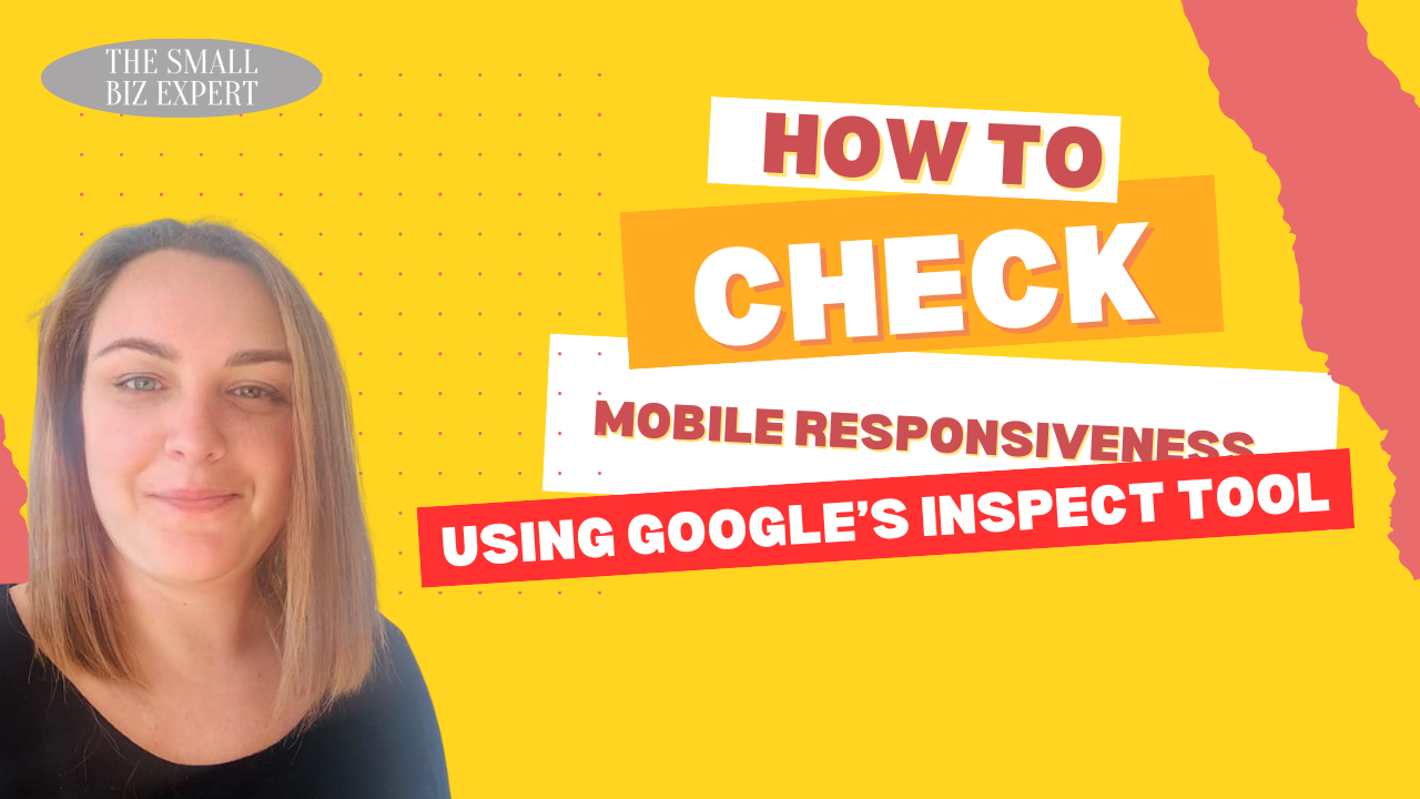
In the UK, almost 80% of online store visits come from mobile phones. If your website doesn’t work well on mobile, you’re losing sales. Tiny text, buttons that are hard to tap, pop-ups that won’t close, or a checkout process that takes ages to load — these are all common mobile pain points that cause people to abandon their purchase. Even if your desktop version looks great, if your mobile experience is slow or awkward, shoppers simply won’t stick around.
It’s also important to remember that how your site displays on mobile can also impact eCommerce SEO - so it’s a step not to ignore.
What to do to make your eCommerce site mobile-friendly.
Start by testing your site on multiple devices, not just your own phone. Review how your homepage, product pages, and checkout flow display on both iPhone and Android, as well as tablets. Try navigating your site as a customer would: can you easily browse, zoom in on product images, and check out without frustration?
If you don’t have access to lots of devices, you can use the Inspect tool in Google Chrome to see how your site appears on different screen sizes.
Just right-click anywhere on your site, select Inspect, then click the mobile/tablet icon in the top left of the panel to toggle between device views. This is a quick way to spot issues with layout, spacing or buttons without needing to borrow five different phones.
Watch How to inspect here.
““This mug is made of ceramic and has a handle.” ”
Cheers.
When shoppers buy online, they can’t pick up or test your product in person, so the words and images have to do a lot of the heavy lifting.
Too often product descriptions are rushed, vague or even worse, just copied and pasted from the supplier's website. This leaves customers with unanswered questions and low confidence in what they are buying.
If your descriptions are too short, too fluffy, or overly technical—or even worse, fail to explain the product benefits—a user may not feel informed enough to make a purchase.
How to write better product descriptions
Speak like a human. Tell people what’s in it for them. Not “100% cotton” — say “soft and breathable cotton to keep you cool”
Use natural, conversational language that matches your brand voice and speaks to your audience, whether that’s playful, professional, or premium. Include practical details such as size, materials, usage instructions, and care guidelines, as well as the target audience for whom it’s best suited.
If you have many similar products, avoid using the same description for each. Not only does this feel impersonal to customers, but it can also lead to SEO issues due to duplicate content. Wherever possible, write unique descriptions that highlight what makes each product special.
Need some hands on help with product descriptions? As a content marketing agency, we can help you create descriptions designed to sell.
You had them. They loved the product. They clicked “Buy Now”. And then you asked for their company name, date of birth, mother’s maiden name and what they had for lunch.
According to the Baymard Institute, 17% of shoppers abandon their cart because the checkout process is too complicated or time-consuming. Every extra field or unnecessary step adds friction, giving people more time to rethink their decision or get distracted.
Common culprits include forcing account creation and asking for unnecessary details (do you really need someone’s company name for them to buy a £10 t-shirt)?
Also - make it EASY! I cannot overstate how many times I’ve gone to pay and forgotten my card details - but ApplePay will always save the day.
What to do about it:
Checkout is the final hurdle, and it should feel effortless. If someone’s made it that far, don’t give them a reason to leave.
Ditch the mandatory account creation
Only ask for what’s needed to ship the thing
Offer guest checkout, fast payment options (PayPal, Klarna, Apple Pay etc).
Make the whole thing feel quick, clear, and non-stressy
People trust people more than they trust brands - especially when shopping online. If your website lacks reviews, testimonials, or customer photos, potential buyers are left to make a decision without any reassurance that your product actually delivers on its promises.
According to BrightLocal, 98% of consumers read online reviews before making a purchase, and 49% trust them as much as personal recommendations. So, when there’s no social proof on your site, you’re asking customers to take a leap of faith, and many won’t.
And it’s about more than building credibility. Reviews help answer questions, reduce uncertainty, and show that others have had a positive experience with your brand. Without them, your products can feel untested or risky, especially to first-time visitors.
Make collecting and displaying reviews part of your ongoing strategy. Utilise a review app that integrates with your e-commerce platform to solicit customer feedback after purchase automatically.
Feature reviews prominently on product pages, and highlight standout testimonials on your homepage or in emails. Even better if they include customer photos - real-world imagery helps people visualise the product in their own lives.
If you’re starting out and haven’t received any reviews yet, consider reaching out to your happy customers personally and asking for their feedback.
Don’t forget other forms of social proof, such as press mentions, influencer features, user-generated content, or "as seen on" badges. The goal is to demonstrate that people trust your brand so that new customers feel secure in doing the same.
Not every visitor will buy the first time they land on your site. In fact, most won’t. They might get distracted, want to compare options or be waiting for payday.
According to Google, 96% of people leave a website without converting on their first visit. That doesn’t mean they’re not interested. It just means they need more time or a little reminder.
If you’re not collecting email addresses or retargeting visitors with ads, then you're relying on people to remember you. And in a world of short attention spans and endless options, that’s a gamble you don’t want to take.
What to do about it:
Start by capturing email addresses - even from people who aren’t ready to buy yet. Offer a discount, free shipping, or exclusive early access in exchange for signing up. Make your signup forms visible across your site, not just in the footer.
Once someone’s on your list, follow up with a short welcome sequence that builds trust and keeps your brand front of mind. Share your story, product highlights, reviews, and helpful tips — not just sales emails. When they’re ready to buy, you’ll be the first brand they think of.
Need help setting up your sequence? We’ve got you - check out our email marketing services.
At the same time, consider setting up retargeting ads on platforms like Meta and Google. These allow you to re-engage people who visited your site but didn’t purchase. You can show them the exact product they looked at, a new collection, or a limited-time offer.
The key is to stay visible without being pushy. Most people need multiple touchpoints before they’re ready to buy, so having a follow-up strategy in place turns “not yet” into “yes”.
However you drive traffic to your site, making it convert can be the hard part, so if you’re looking for help, why not get in touch with us to discover how we can help you make more sales.